
Analytics Dashboard to Turn Task Data into Managerial Decisions
Overview
My Role : Product Designer
Responsibility : Research, Ideation, UX/UI Design
Tool : Miro, Figma
Duration : 05.2023~06.2023
Collaboration : Product, Data, Development
About Analytic Dashboard
The Analytics Dashboard was designed to help managers quickly understand project progress and team capacity across multiple projects.
To support the company’s goal of expanding seats within existing customers, the dashboard prioritizes clear managerial value through fast, preset insights rather than complex customization.
By bringing task status, activity trends, and capacity signals into one view, managers can spot blockers early, plan resources with confidence, and make decisions that improve both team performance and product adoption.
Background
The company goal was to expand seats within existing customers for growth.
However, managers did not see enough value in the product to justify adding more seats.
Early churn signals showed that some customers were actively considering leaving.
Problem
Managers are responsible for tracking progress, bottlenecks, and team performance across many projects and workspaces, but the product only exposes fragmented, task-level data. As a result, they must manually export and process data in external tools to understand team health and project status, making performance evaluation slow, error-prone, and difficult to scale.
Challenge
The challenge was to transform complex, multi-project task data into clear, reliable management insights so managers can assess progress and bottlenecks quickly without manual setup, customization, or external reporting tools.
Impact
Achieved dashboard usage(first month) : 25%
Helped retain at-risk customers by reducing reliance on external reporting
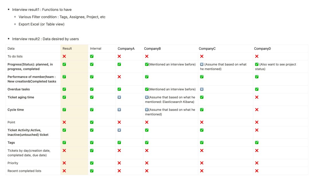
Research insights & Decision
1. Strategy Decision: Preset Dashboard for MVP
Based on user research, we decided to launch the analytics dashboard as a preset, insight-driven MVP, supported by strong contextual filters.
The primary pain point was not flexibility, but the inability to quickly understand team status and risks from fragmented project data.
Managers needed immediate, synthesized insights to support day-to-day decisions, rather than additional setup or configuration.
As a result, instead of adding more dashboards or charts, we focused on designing reusable predefined views, paired with powerful filters that allow managers to apply the same insights across different projects, teams, and timeframes.
2. Design Focus
Which predefined insights would deliver the highest managerial value on first use?
Which filters were essential to make those insights reusable across projects, people, and time?
Design Solutions
Design Solutions
Based on research, we discussed with data team & developers to finalize five essential top filters:
Date – to review performance over specific periods
Project – to view on specific project’s status
Assignee – to monitor individual or team’s workload
Tag – to view the segment work by milestone, category, custom grouping, etc depending on companies
These filters provide the flexibility managers need without requiring dashboard customization, keeping the experience fast and decision-focused.
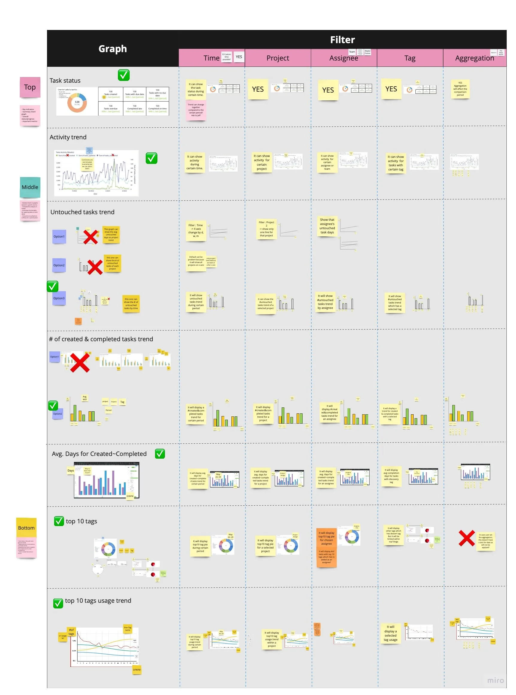
Based on research patterns across participants, we identified these core management questions and designed predefined dashboard views to answer each one.
1. Are we on track?
Managers needed a fast way to understand overall progress without exporting data or checking multiple projects.
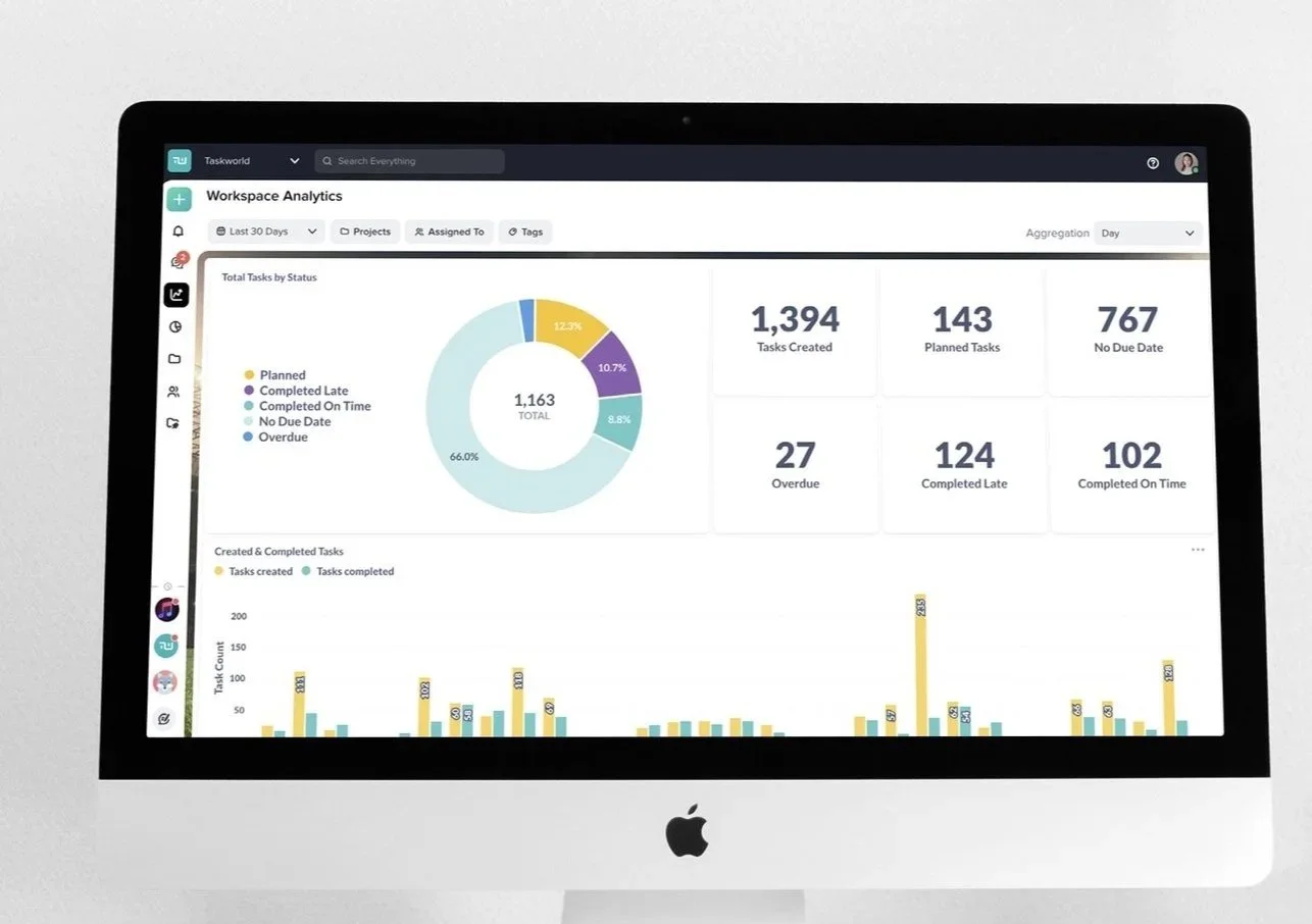
Task status summary
Provides a snapshot of the current distribution of task statuses to help managers quickly gauge overall momentum. A donut chart makes status distribution easy to scan at a glance, while number cards surface exact counts for quick validation.
Created vs completed tasks over time
Shows whether task completion is keeping pace with incoming work.
A bar chart was used to clearly and intuitively compare task creation and completion over time.
2. Where are we blocked?
Research showed managers manually skimmed task comments and activity logs to detect stalled work. → Replaced manual task by task check with a quick signal of team health.
Average completion time
Indicates how long tasks typically take from creation to completion.
A bar chart visualizes average completion time by task creation date, making it easy to spot delays in efficiency over time.Task activity trend (comments, task update)
Highlights changes in team activity that may signal bottlenecks or disengagement.
A line chart was used to show activity over time, allowing managers to quickly detect sudden drops.
