
Improving Supermarket Checkout Efficiency
My Role : UX Researcher & Product Designer
Onsite research, Heuristic evaluation, UX/UI design
Tool : Figma, Miro
Duration : 06.2024~11.2024
Overview
About Queue Bursting
When supermarket checkout lines are long, staff can use the Queue Bursting App to shorten customer wait times. While customers are in line, staff scan the items in their baskets, allowing them to proceed directly to payment at the counter.
Background
During major holidays and peak shopping hours, supermarkets experience a sharp increase in customer traffic while often facing staff shortages. This combination leads to long checkout queues, increased customer frustration, and operational strain on cashiers.
To address this, a Queue Bursting service was introduced several years ago. However, despite its intended benefits, adoption and effectiveness remained limited.
Problem
The existing Queue Bursting App failed to deliver meaningful value for both frontline staff and customers, resulting in a frustrating overall checkout experience.
Staff perspective
Although staff used Queue Bursting during peak hours and holiday seasons to assist cashiers, the app did not improve operational efficiency. Frequent scanning failures and inefficient error-handling flows forced staff to restart tasks, increasing effort and slowing down service. Over time, this reduced trust in the tool and led to inconsistent or abandoned usage.
Customer perspective
From the customer’s point of view, Queue Bursting added interaction without reducing waiting time. Customers were asked to pause while staff scanned their items in the queue, yet still experienced long waits at checkout. When scanning errors occurred, the process felt repetitive and confusing, leading to frustration of checkout experience.
Challenge
How might we redesign Queue Bursting to create real time savings for customers while seamlessly supporting staff workflows during peak operations?
Impact
Improved scanning fail 50%
Improved scannable items 86%
Reduced scanning time 56%
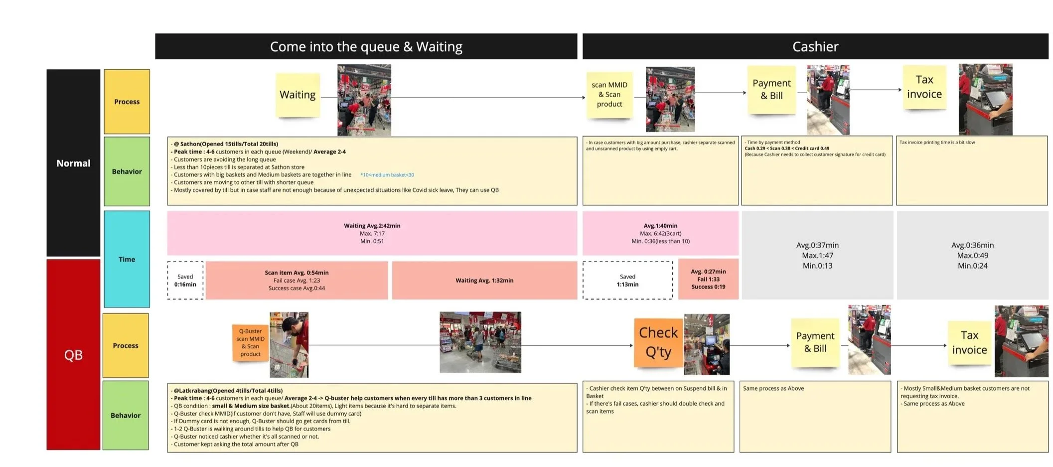
Research
Research approach
I conducted on-site observational research to understand real checkout workflows and Queue Bursting usage
1.Research objective
Understand how staff use Queue Bursting during peak times
Identify failure cases that prevent Queue Bursting from reducing queues
Evaluate UX/UI issues through heuristic evaluation
2. Scope
The research focused on peak-hour operations and small to medium-sized baskets (approximately 20 items), where Queue Bursting was intended to be most effective. The study did not include off-peak usage or large/bulky-item baskets.
3. Methodology
On-site observational research
Heuristic evaluation of the existing Queue Bursting App
4. Evaluation Criteria
Average scanning time per basket
Percentage of Queue Bursting failure cases
Time comparison between Queue Bursting and non–Queue Bursting checkout lines
Time comparison between Queue Bursting success and failure case
Key Findings (Onsite research)
1. Queue Bursting efficiency drops sharply when failures occur
Queue Bursting only delivers meaningful time savings when scanning is error-free. Even a small number of failures significantly reduces its effectiveness.
Successful Queue Bursting sessions were 2× faster than failed sessions
Failed Queue Bursting sessions often approached or exceeded the time of standard checkout
2. Limited flexibility for non-member customers
Queue Bursting required staff to scan a customer’s membership card before scanning items. For customers without a membership card, staff had to use shared day-pass cards provided by the store.
Day-pass cards were limited in quantity and When all cards were in use, staff had to walk back to the cashier to retrieve used cards before continuing Queue Bursting.
This dependency added unnecessary steps, increased walking time, and frequently interrupted the scanning flow, reducing the effectiveness of Queue Bursting during peak periods.
3. Scanning failure items were not random
A meaningful portion of baskets included at least one unscannable item
The majority of scanning failures occurred with frozen and imported goods categories
A smaller portion of failures was caused by barcode formatting issues
UX/UI Heuristic Findings
1. Lack of Visibility of System Status
The app does not display total quantity, total amount, or promotions during scanning. This Directly affected both staff and customers and caused repeated customer questions and slows checkout
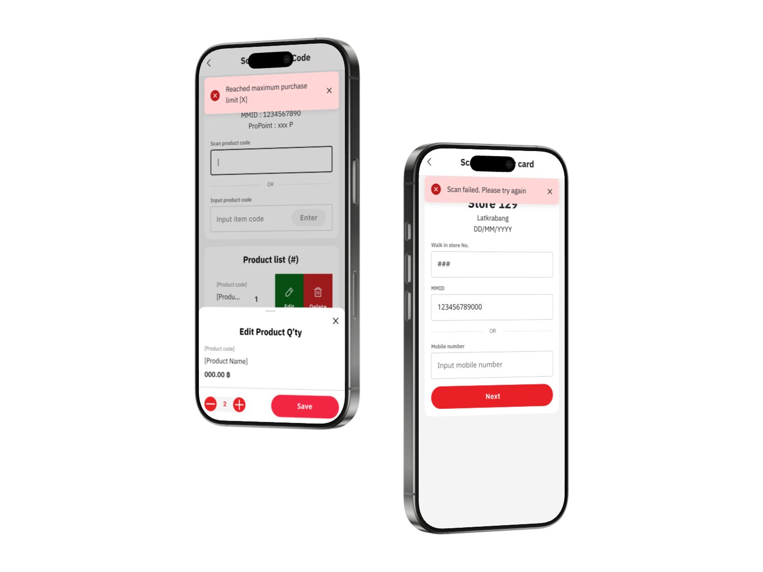
2. Error Prevention Failure with Quantity Limits
Items can be scanned beyond the allowed quantity without any warning, but are automatically removed at POS. This creates a critical communication gap, as customers expect to purchase the scanned quantity and are unexpectedly prevented from doing so at checkout, leading to confusion and frustration.
3. Loss of User Control After Errors
Error messages are unclear and inconsistent, and closing an error popup forces users back to the first screen. As a result, staff must restart the scanning process, slowing down checkout.

Design Direction
This app is an internal tool used by store staff. Instead of prioritizing visual aesthetics, the design focuses on clarity, speed, and error prevention to support efficient scanning and checkout workflows.
Design Solutions

2. Improved Error Handling flow
Error cases were clearly identified and mapped to specific, understandable error messages. Each message explains what went wrong and what action the staff should take.
When a product reaches its quantity limit, the system shows the error immediately, allowing staff to inform customers before reaching POS.
The error flow was improved to allow users to dismiss error messages and continue working on the same screen, instead of being forced back to the beginning of the scanning process.

Improving Payment Transparency During Scanning
When staff help scanning items in a customer basket, customers frequently asked the total amount and promotion. To help customer prepare payment, added the total amount and promotion at the end of item list.
3. DayPass
Many customers don’t have memberships, so staff used a dummy card in the store. However, the cards were in limited supply, requiring staff to go to the counter to retrieve them. To address this, we created an access option for daypass customers. At the end of the process, staff can print a QR code, which customers can easily present at the counter for payment.